TREASURY.GOV
CONCEPT

OVERVIEW
I took on the challenge of redesigning the Treasury.gov website to tackle usability issues and enhance accessibility for citizens. Working primarily alone, I applied user-centered design principles to create an intuitive, user-friendly interface. This redesign strengthened the connection between the Treasury Department and the public, amplifying its mission and impact. The project culminated in a clickable Figma prototype for mobile and desktop views, addressing key issues users faced when visiting the site.
REDESIGN STAGES
ROLE
I worked as a UX Designer with a colleague to evaluate the current website. Then I conducted research and analysis before designing a website prototype.
TIMELINE
This project spanned four weeks.
TOOLS
Adobe Color, Adobe Stock, BGJar, Figjam, Figma, G Suite, Material Design 3, Photoshop, Stark, Unsplash, USWDS
SCOPE
The primary focus of this project was redesigning the homepage, improving menu navigation, and ensuring a satisfying mobile experience.
DISCOVERING
USER PROBLEMS
Assessing Usability Through Heuristic Analysis
I evaluated the Treasury.gov website with a colleague using design heuristics, identifying pain points such as confusing navigation options.

1. OVERLAY ISSUES
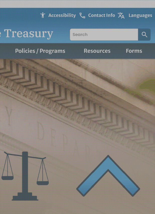
The current website suffers from having text overlapping the Treasury building. It's a lot of text and the contrast is not high.

2. TEXT JARGON
It's unclear what options users will find in the navigation menu.

3. HIDDEN NAVIGATION
Accessibility features are hidden in the secondary navigation bar and are difficult to see.
Gathering Insights from User Interviews and Testing
Our user testing revealed how participants interacted with the website, assessing their ability to navigate and locate target pages, while also capturing their feedback on the experience.

NAVIGATION TESTING
We conducted a user test to evaluate the website's usability and created a graph showing hard-to-find pages. Surprisingly, 40% of users couldn’t find the social media links. This insight guided our redesign efforts to enhance visibility and user experience.
_edited.png)
Average Task Duration
We also recorded the time each task took. None took less than the target of 30 seconds, which highlighted the need for a more intuitive navigation system to improve efficiency.
DEFINING ISSUES TO BE ADDRESSED
Gathering and Organizing Insights from User Research
After initial testing I moved directly to prioritizing website features. Given the Treasury website's broad audience, creating a detailed user persona would not have been practical. Instead, I focused on identifying key features that would benefit users and structuring the information architecture to ensure ease of access and usability for everyone. By prioritizing features and working on the information architecture, I aimed to streamline the user experience, making it intuitive and accessible for users.
Feedback-Driven Feature Prioritization
I organized testing feedback in a matrix to see what priorities my redesign needed to target. The prioritization matrix depicted priorities increasing on the Y axis for organizational importance and on the X axis for user importance. I used sticky notes to map out user feedback: red notes highlighted issues multiple testers commented on, while yellow and green notes indicated less frequently reported issues.
The top three priorities identified were:
1. Improving the text on the main navigation.
2. Enhancing accessibility by adjusting contrast and aesthetics.
3. Rearranging the navigation options to match user expectations.
.png)
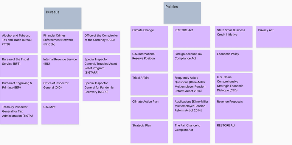
Card Sorting FOR NAVIgaTION OPTIMIZATION
Objective: By conducting a card sorting exercise, I aimed to reorganize website pages based on organic relationships to improve the user experience.
Process: I categorized pages based on content and user relevance, including external links to ensure a seamless user flow.
Outcome: New navigation options, such as creating a bureaus dropdown, became apparent. This method highlighted logical groupings that aligned with users' mental models, ensuring a more intuitive navigation structure.
WEBSITE INFORMATION Architecture
After completing the card sorting exercise, I created a visual sitemap to enhance the clarity and usability of the website's structure. The revised information architecture simplifies finding relevant information, whether on the Treasury site or related government websites. By creating a visual sitemap, stakeholders can visualize how users navigate the site, facilitating better planning and early identification of potential navigation issues.
Below is a visualization of part of the homepage's structure (yellow), specifically focusing on the website's footer (grey). The page links (green) have been reorganized into categories (blue) for better navigation. External site links (pink) are included to illustrate how users could exit the site, and further discussion with stakeholders would determine whether these links should be retained and if a notification screen should warn users when navigating away from the Treasury.


DEVELOPING SOLUTIONS
PROTOTYPING
Prototyping played a crucial role in the development process, allowing me to visualize and refine the design before implementation. This iterative approach ensured that the final product was user-centric and met all key requirements. The prototyping process was comprehensive, involving several key stages to ensure a robust final design:

1. PAPER SKETCHING
I began the prototyping process with rough sketches to quickly visualize ideas and explore different layout options. This step allowed for rapid iteration and creative brainstorming.
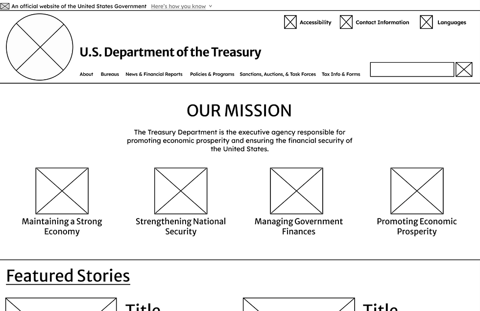
2. DIGITAL WIREFRAMING
Next, I created low-fidelity wireframes to establish the basic structure and layout of the website. These wireframes focused on the placement of key elements, providing a clear blueprint for the design.

3. PROTOTYPING & TESTING
I then developed an interactive prototype based on the wireframes. This early prototype included basic functionality and navigation, enabling user interactions and testing feedback. Having testers provide early design feedback allowed for real-time adjustments and ensured the navigation was intuitive and user-friendly.

4. INCREASING FIDELITY
Based on user feedback and testing results, I iterated on the prototypes, continually refining the design and improving usability. This iterative process ensured that each prototype version addressed user needs and enhanced the overall user experience.

5. RESPONSIVE DESIGN
In order to ensure that the user experience was exceptional for mobile users, it was important to give equal time to develop and test the mobile version of the website. I made sure to test the website on various devices and incorporate testing feedback.
style guide and design system
A style guide or design system to ensures consistency across all visual and interactive elements. Utilizing the U.S. Web Design System (USWDS) was instrumental in creating a cohesive and accessible design system for the project.
Style Tile
I developed a style tile to convey the overall aesthetic of the redesign. This approach enabled me to concentrate on the crucial aspects of colors, typography, buttons, and visual elements, independent of the website's screens. After ensuring that the colors met accessibility standards for contrast I applied them to the screens.
STYLE TILE
INCORPORATING THE U.S. WEB DESIGN SYSTEM
The USWDS ensures that the website complies with federal guidelines and best practices, establishing a uniform standard that enhances credibility and trust. It also prioritizes accessibility and complies with disability standards and laws. The USWDS provides a consistent framework for design elements across .gov websites creating a cohesive user experience that feels intuitive and professional. Finally, the components and patterns result from extensive research and testing, ensuring that the diverse needs of government website users are met.

OFFICIAL DROPDOWN BANNER
I added the official .gov dropdown banner to let users know they are viewing an official website, enhancing trust and credibility.

NAVIGATION BREADCRUMBS
I added underlines to show users when clicking on a breadcrumb is possible, clearly indicating that text links will navigate them to the appropriate page.

SEARCH PAGINATION
I added helpful search page pagination so now users know what page of results they are on, how many pages there are total, and have a way to quickly navigate to the next page or end, improving the overall search experience.

EXTERNAL LINK ICONS
I added icons to show users when they would be taken away from the .gov website to help prevent confusion and ensure users are aware of navigating to external sites.

404 PAGE
I utilized the 404 page template so that if users end up navigating to a page that doesn't exist they understand what happened and can either return to the homepage, email support, or call for help.
DELIVERING A USER-TESTED PRODUCT
USER TESTING AND INSIGHTS
Goals: Identify issues and gather feedback to ensure the design meets user needs and expectations.
Tasks:
-
Open and close the menu on mobile.
-
Find the Small Business Credit Initiative page.
-
Navigate back to the homepage.
-
Find a featured article on the homepage (land on the 404 page).
Findings:
-
Menu Navigation: Users found the menu options easy to see and navigate, despite some being surprised at the side-opening menu.
-
Search Functionality: Some users encountered search functionality and navigation issues, preventing them from landing on the correct page.
-
Returning Home: Most users returned to the homepage via breadcrumbs or the header logo; a few relied on the back button.
-
Content Navigation: A few users overlooked the homepage content and relied on menus and search options.

DESIGN REFINEMENT
Based on the results of my final user testing and from feedback I made changes to the design to ensure that the final product achieved the design goal of improving the user experience.
WEBSITE HEADER
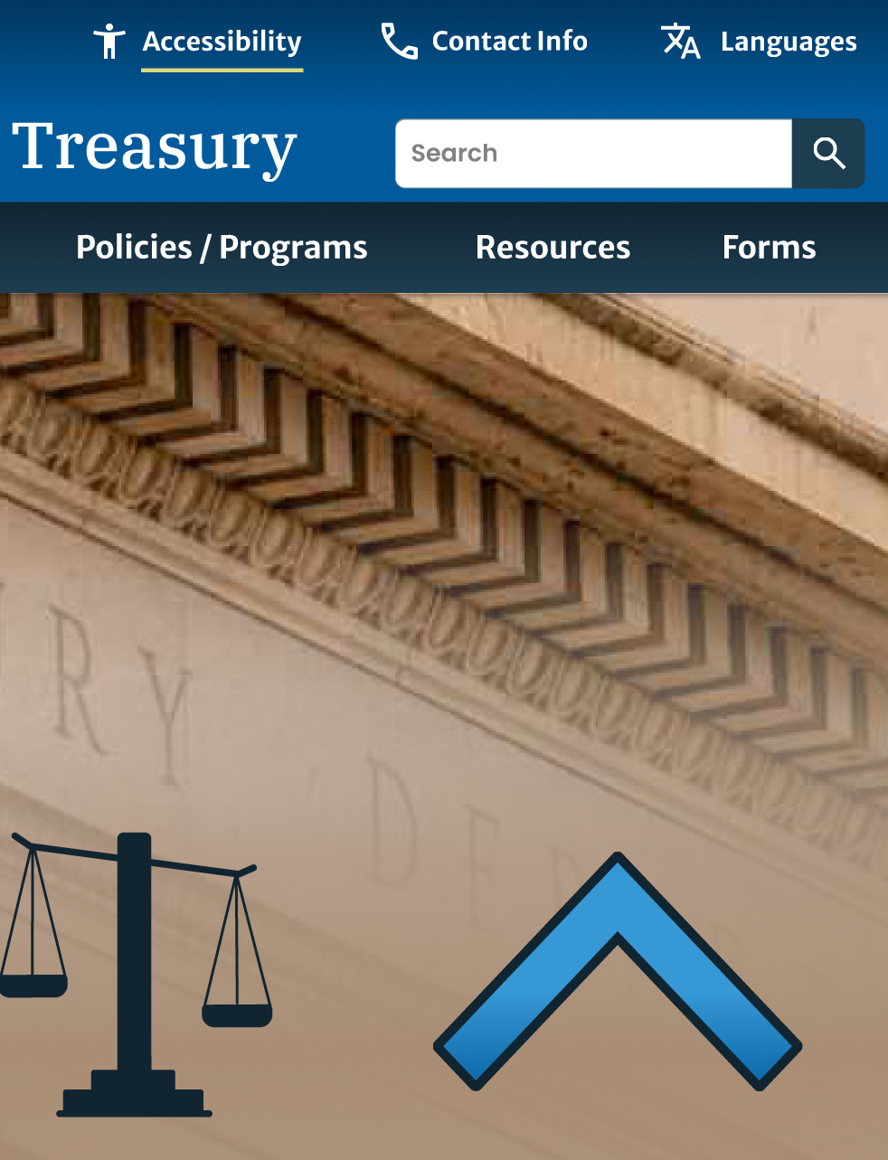
After testing I increased the contrast ratio between the banner gradient and the navigation text. It's now easier to distinguish between the title and background. I also increased spacing between secondary navigation options based on design principles of proximity.
SEARCH RESULTS
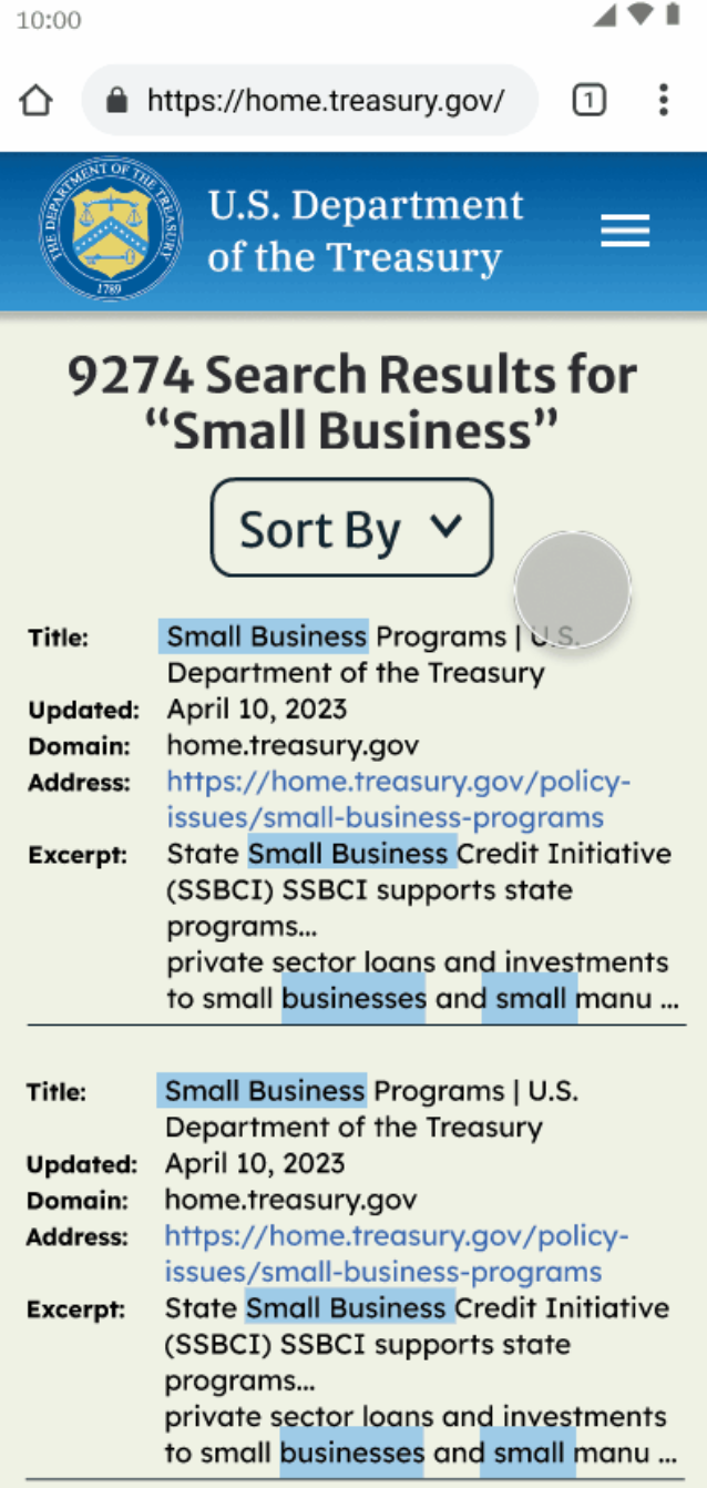
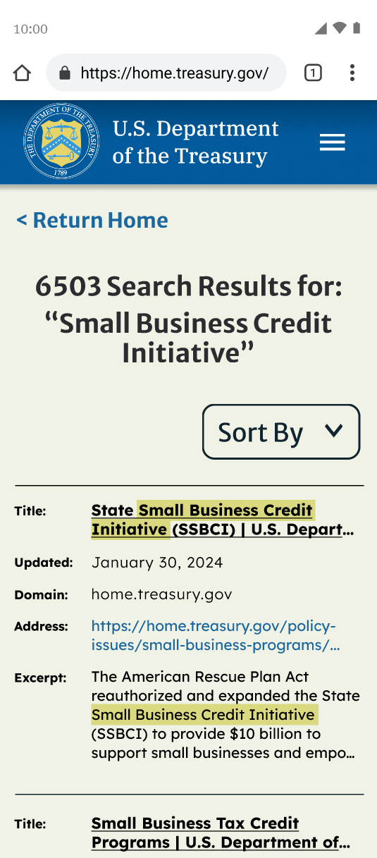
The space between text elements was increased to enhance readability. Titles were underlined and bolded while lesser details were put in a thinner font, creating a clear visual hierarchy.


MOBILE SCROLLING
To reduce scrolling on mobile devices, I created image carousels.
Hi-FIDELITY PROTOTYPE
The project ended in a high-fidelity, clickable prototype using Figma. This prototype was made to closely mimick the final product, allowing stakeholders to interact with and experience the design as it would appear once fully implemented.
LEARNING FROM THE EXPERIENCE
INSIGHTS
Here are just a few of the insights gained during this project.
KNOW YOUR USER
Because design decisions are made with the user in mind it's important to really understand what the user needs.
MAKE IT EASY
If the task is not easy to accomplish users will give up or leave your website.
TEST AT EVERY STAGE
Testing paper prototypes and early wireframes can save a lot of time.
DESIGN FOR MOBILE
The mobile experience is entirely different from desktop, so it's just as critical to design and test for it.
NEXT STEPS
Here are a few things I would like to do if I had more time to work on this project.
DESIGN FOR TABLET
While least used, designing for tablet screen sizes also helps with screen responsiveness.
CREATE DARK MODE
Many users prefer to use dark mode to reduce eye strain.
CONDUCT A/B TESTING
A/B Testing could help make sure that icons and colors are connecting with users.
HEADER SIZE
Shrink the size of the header to ensure it doesn’t dominate screen space, especially on laptops and medium-sized screens.


